Friday, 17 April 2015
Final Piece
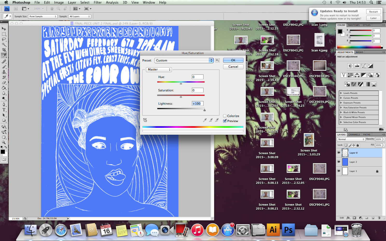
For my final piece, I began by choosing the image from my contact sheet that I wanted to use and I started drawing an image of my model onto my page. I then began adding background details and the text for my gig poster. Once I had done that I went over it to make it darker and easier to use on photoshop. I then began adding colour to the gig poster and testing out different colours to make it as psychedelic as I could.
I then decided on the colours I wanted to use for my final piece and decided to add a swirl pattern in the background to add to the 60's vibe of my poster.
I then decided that the swirl in the background wasn't enough so I hand drew some more wavey patterns, shaded every other one in and then scanned it into photoshop. When I had put it on photoshop I adjusted the threshold and took away the white. Once I had got it over the top of my gig poster I began playing around with the colours again to try to get it as interesting and eye catching as possible.
When I was happy I then started to adjust the filter on the colours.
I then decided that the swirls in the background were too flat and 2D and I wanted them to stand out. So I made a copy of the layer with the swirls, and changed the colour to a complementary colour (pink and green) and then moved it slightly so you can just see the edge of the colour pop out, which gives it an eye catching edge. Now that I had decided on how I want it all to look, I again started playing around with the colours until I found one that I was 100% happy with.
I then came between two of my final choices, and I decided to go with the left instead of the right. My reason for NOT choosing the one on the right is because the colour is so contrasting it becomes confusing and hard to read and it doesn't look as good and it looks like it doesn't work. However the one on the right is still easy to read, psychedelic, follows my theme throughout the whole project and as it is a gig poster it is supposed to be eye catching and I feel like I achieve that in my final gig poster.
Here is my final piece.
Wednesday, 15 April 2015
Subscribe to:
Comments (Atom)


